
POSY MAGAZINE
The creation of a visual identity for a fictional publication revolving around floriculture.


Concept
Posy is a magazine dedicated to the atypical art of floral design that explores creativity while honoring the endless possibilities of floriculture. Conceptual directions include creative, blooming, sweet, inventive, contemporary, visual, colorful, unique, and elegant.
Process
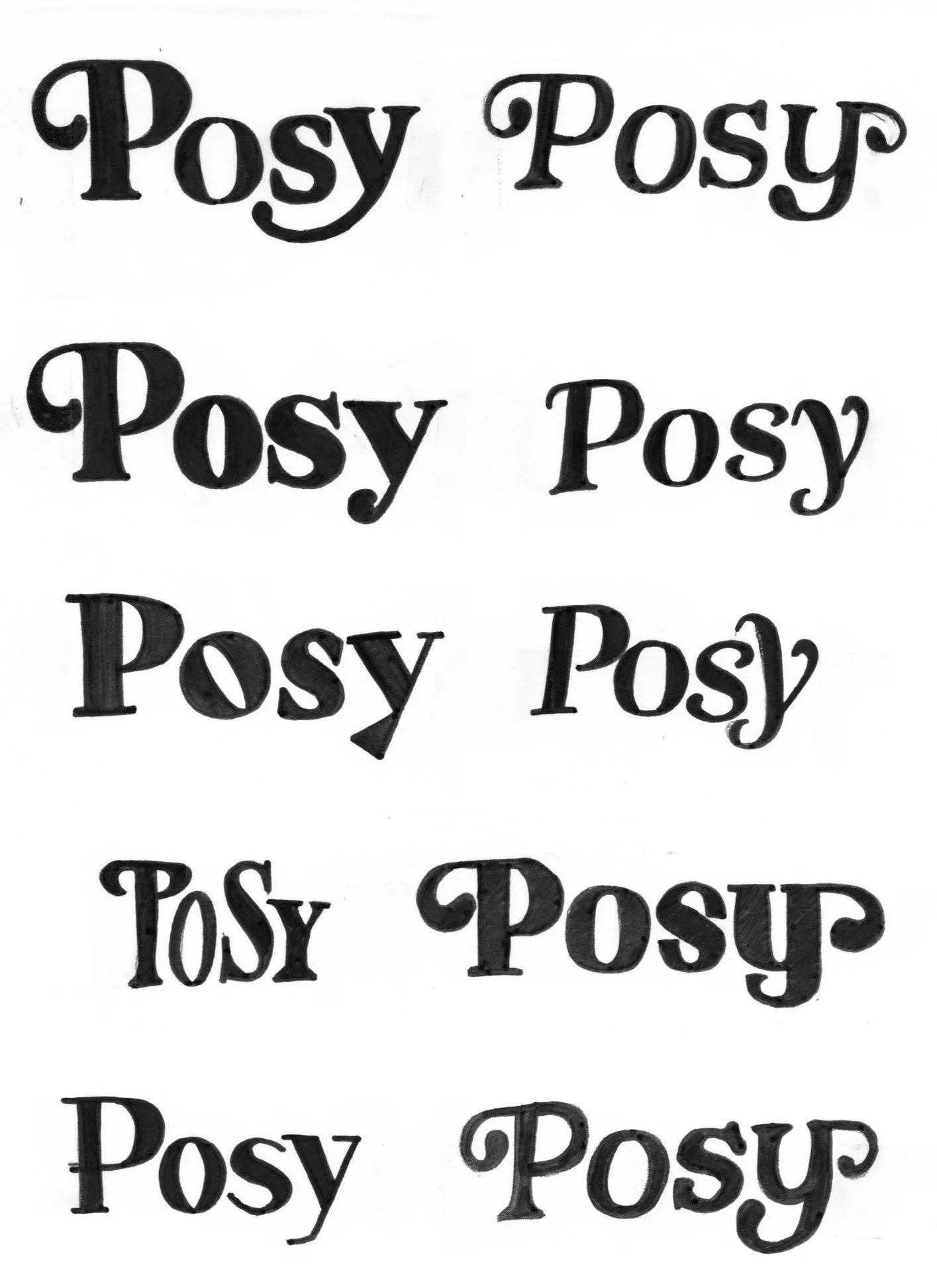
Wordmark Sketches
The design attributes I chose to focus on in my design were rhythm, shape, and tension. The typographic attributes I emphasized were high contrast, flowing, and contemporary. I explored these elements through my process sketches until I developed my final wordmark that was the most concise representation of the publication’s message.


Final Wordmark
The final wordmark was adapted from the typeface Marshmallow Script. Design attributes include rhythm, growth, movement, and tension. Typographic attributes include stroke weight contrast, narrow apertures, short descender, and narrow counter.

Layout Iteration
I worked to communicate the same elements that inspired my wordmark through my publication spreads. I kept the spreads elegant, colorful, and fresh. I did this through keeping a more traditional body copy layout, but experimenting with the juxtaposition of title and imagery throughout the page.


Final Magazine
Cover + Spreads


Visual Identity
